Move Forward.
Introducing the new face of STNET Radio. Bold. Modern. Impactful.
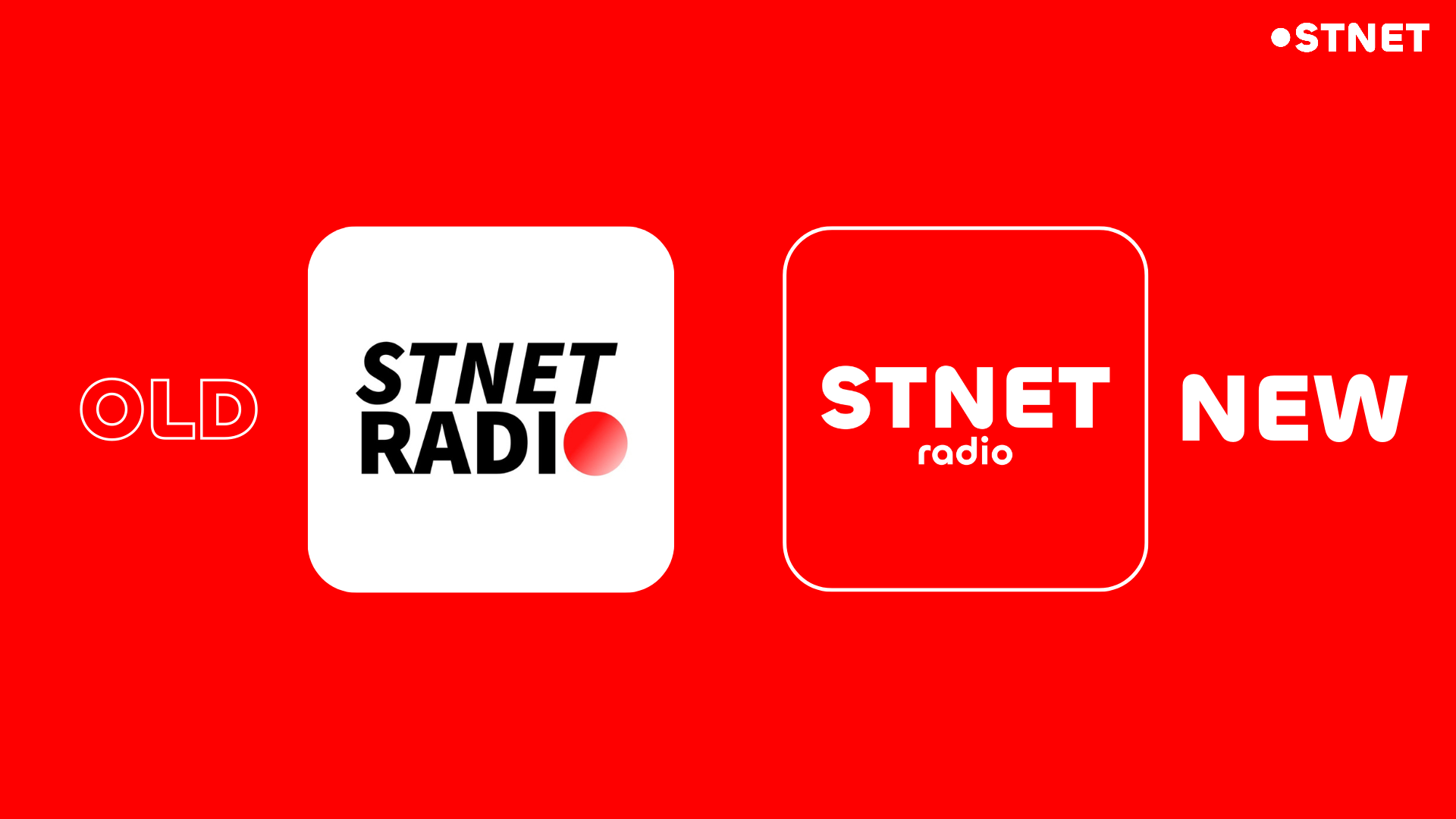
The Evolution
Design Transformation
We've evolved from a soft gradient to a striking, solid red. It's not just a color change; it's a statement of confidence and clarity.
Typography
A more dynamic, condensed font gives "STNET" a stronger presence, while "radio" gets a playful, curved design.
Layout
Separating "radio" from the main block adds movement and friendliness to the brand identity.
Motion
Dynamic animations bring the brand to life, making every interaction feel responsive and alive.
Solid Red
Eliminating gradients for a cleaner, more versatile look across all platforms.
Modern Type
Contemporary typeface that balances professionalism with vibrant energy.
Visual Interest
Subtle circular elements add depth and character to the composition.
Versatility
Designed to look perfect on everything from app icons to billboards.
Stay tuned.
The new look is everywhere.